Your AI Adoption Number Is Lying to You
I've sat through a lot of AI rollout reviews. There's almost always a slide with one big number on it, "78% adoption!", everyone nods, and the meeting moves on. That number is the most reassuring lie in the room.
It's not that it's false. It's that it can't tell the difference between a tool people genuinely depend on and one they opened once to make the prompt go away. A rollout that's quietly failing and one that's actually working look identical on that slide. So we keep funding the wrong things and killing the right ones, confidently, with a chart to back us up.
Here's how I've learned to measure adoption so it actually tells you something.
Breadth isn't depth
The first problem is that "used the tool" is a binary, and adoption isn't. People move along a ladder, and almost everyone falls off it somewhere:

Most people who touch a tool never climb to relying on it.
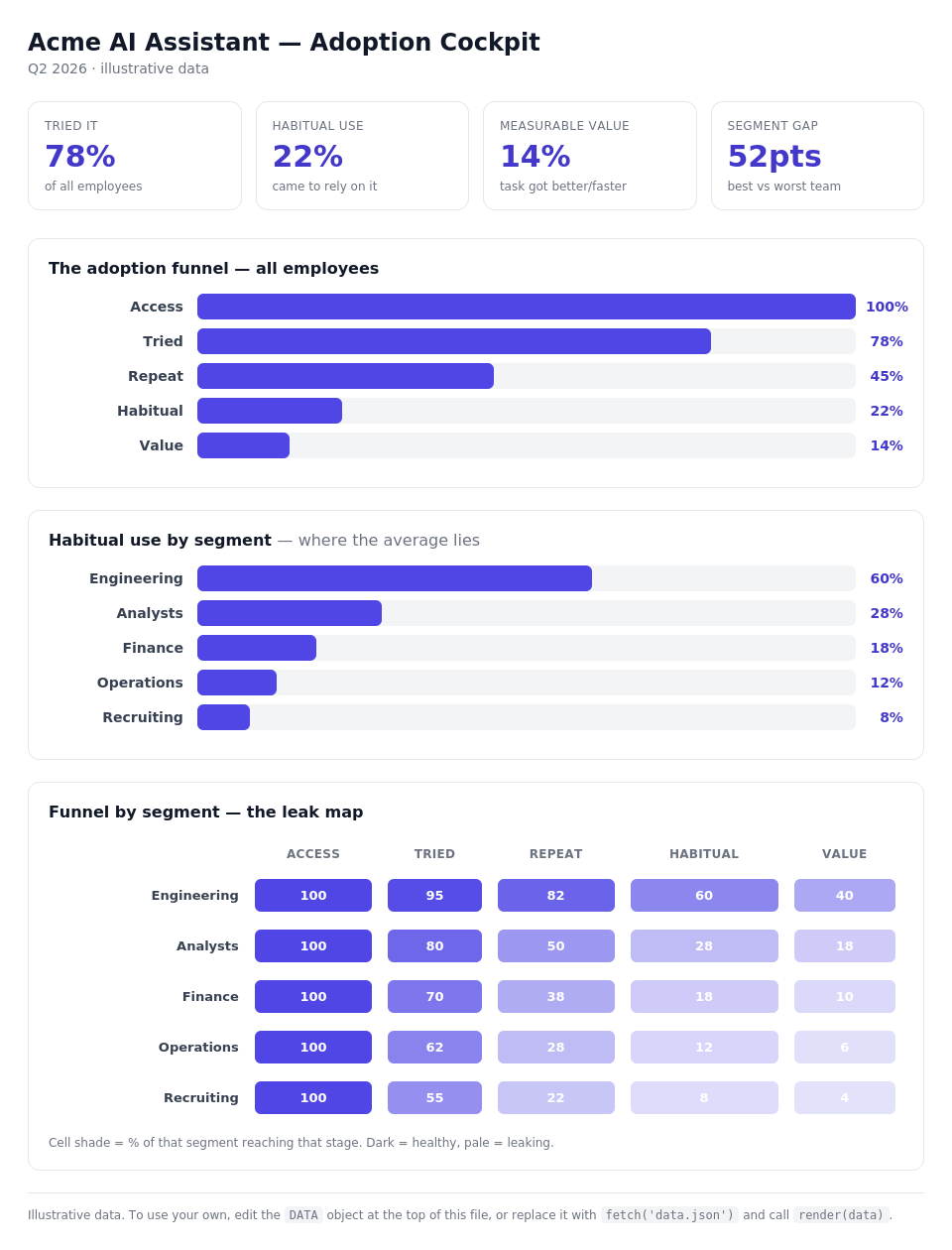
The single adoption rate almost always reports that second bar, tried it once. But the bottom three rungs are the only ones that change how work gets done. An org with 80% trial and 8% habitual use has a completely different problem than one with 30% trial and 25% habitual use, and the headline number reports both as "fine."
So the first fix is cheap: stop counting logins. Count whether people came back without being told to, whether the tool became part of a recurring task, and whether that task actually got faster or better. Same data you already have, read one level deeper.
The average is hiding four different stories
The second problem is worse, because it's invisible. Adoption is never uniform, and the moment you average everyone together you erase the only signal worth having.

The same headline number, four very different teams underneath.
Your senior engineers were going to adopt an AI coding tool no matter what you did. Your recruiters and your ops managers are a different story, and they're usually the people with the most to gain, because they had the furthest to climb. When you report one number, the early adopters carry the average and the teams that bounced off the tool disappear from view. You declare victory while half the company quietly went back to the old way.
The fix is to cut every number by the dimensions that actually predict whether someone climbs the ladder:
- Role / job family: the work itself decides whether the tool fits.
- Technical background: the strongest predictor of where people stall, and the one almost everyone ignores.
- Tenure: new hires and ten-year veterans adopt differently, in both directions.
- Task type: a scoped, repeating task looks nothing like open-ended work.
Cut the funnel this way and it stops being a number and becomes a map. You can see exactly which people, doing which work, stalled at which rung. And once you can see that, the fix is obvious instead of a vague "we need more enablement." A team stuck at trial usually just never saw the tool used on their own work; that's a show, don't tell problem, not a motivation problem. A team stuck at habitual use usually has a workflow-integration gap, not a skills gap. You stop spraying the same training at everyone and start sending it where the funnel actually leaks.
What to actually use
You don't need anything exotic. Here's the stack I reach for, cheapest-first:
- Start with what you already own. Your AI vendor's admin console (Microsoft Copilot's usage dashboard, your LLM provider's seat analytics) gives you crude breadth for free. It won't show depth or segments, but it's a starting baseline.
- Instrument the ladder with product analytics. Amplitude, Mixpanel, or PostHog (open-source, generous free tier) let you define events for repeat and habitual use instead of just first touch. This is the part most teams skip, and it's the part that matters.
- Join the segments from your HR data. Pull role, tenure, and technical background out of your HRIS into a warehouse (Snowflake, BigQuery, or Databricks) so usage events can be sliced by who the person actually is.
- Read it by segment in BI. Point Power BI, Tableau, Amazon QuickSight, Looker, or Metabase (free/open-source) at that warehouse and build one view: the funnel, broken out by segment. The only rule: never show the aggregate without the breakdown next to it.
And if you're a five-person team? A spreadsheet and an honest weekly look at "who's still using this" beats a six-figure platform you never configure. The method is what matters, not the tooling.
Put it on a dashboard
All of this should end up on one screen you actually look at every week. Here's roughly what that looks like:
Open the live, interactive dashboard →
There are two ways to get there, and you don't have to pick the fancy one.
The no-code route. In Power BI, Tableau, or QuickSight, this is three visuals over a single query: a funnel, a habitual-use-by-segment bar chart, and a segment × stage matrix shaded as a heatmap, the "leak map." If your usage events and a few HR attributes already land in a warehouse, you can build the whole thing in an afternoon. The shaded matrix is the one that earns its keep: pale cells are exactly where a segment falls off, and they tell you where to spend your next dollar of enablement.
The lightweight route. When I want something I can drop straight into a page or hand to someone without a BI license, I keep a tiny self-contained HTML dashboard where every number lives in one DATA block at the top. Updating it is a one-object edit, or a fetch() if you want it live:
// Swap the illustrative numbers for your own, or load them from anywhere:
const DATA = await fetch('/data/adoption.json').then(r => r.json());
render(DATA);   // everything redraws from that one object
That's the whole trick: keep the data separate from the drawing, so refreshing the dashboard is just handing render() a new object. The same pattern works in React: hold DATA in state and pass it to your chart components. (Open the live demo →)
The checklist
Copy this and run it for your next rollout:
- Define your ladder: five stages max, in your own terms (access → trial → repeat → habitual → value).
- Instrument repeat and habitual use, not just first touch.
- Pick three segmentation dimensions that matter for your workforce (start with role + technical background + one more).
- Pull segment attributes from your HRIS into wherever your usage data lives.
- Build one view: the funnel, by segment. Never report the average alone.
- Find the leaks: which segment stalls at which rung.
- Route the intervention to the leak, not to everyone.
- Re-measure the same way. If the framework doesn't change what you do next, you're just making prettier dashboards.
The one number worth keeping
If you take one thing from this: stop asking "what's our adoption rate?" and start asking "which people, doing which work, actually came to rely on this, and where did everyone else fall off?"
That's the whole method. The rest is instrumentation. The single adoption number will keep climbing up and to the right on the slide. The question is whether anyone in the room can tell you what it means.
Sebastian Undurraga is a Senior Technical Program Manager working on enterprise AI deployment. He writes about AI adoption, knowledge graphs, and making advanced tools usable across the full range of knowledge work at unduslabs.com.